Sally Hansen - How To Videos

Creative Director - Robert Waddilove

Sally Hansen

Problem: Sally Hansen wanted to position itself as the ‘Expert Partner’ in Nail Care and Colour by using content on YouTube to appeal to a younger audience.

Solution: We wanted to position Sally Hansen as a brand that not only created products that helped women with their nails, but as a brand that could create content as useful as their products. 

An original YouTube channel with seven ‘how-to’ films which simply gave answers to common queries online, in a quick, straightforward way.

Results: The campaign was highly successful with very strong watch time and subscriber numbers proving audiences were finding content which helped them. 

  • 7k subscribers in 3 months, now over 9k with no new content
  • Viewers were 12x more likely to subscribe than the industry average. 1,017 subscribers per video 
  • Average watch time of 80%
  • Over 1,5million views in 3 months.
download (4).png

MALIBU - Best Summer Ever I & II

Creative & YouTube Strategy - Robert Waddilove

The Brief: MALIBU was no longer relevant amongst its target of young Millennials and was failing to recruit new drinkers. 
AnalogFolk wanted to give the brand a greater role in their summer. Inspired by a product truth and audience insight we asked ourselves; ‘How can Malibu help young drinkers feel free and happy, so they get the most out of summer?’

Solution:Working in collaboration with AnalogFolk, we developed a YouTube content strategy which would compliment the other ATL activity AnalogFolk were creating. 

We knew that there were two relevant ways audiences would interact with content from MALIBU, which was through a HUB series following a group of five 20 somethings around Europe & USA. Alongside HERO content which would stand as self contained content, but also compliment the HUB content if you were watching the series already. 

Results: 10m video views (4% was organic reach compared to the industry benchmark of 2.5%)
765% increase in subscribers in week one, Total viewing time at 10 years plus, Video completion rate as high as 26%,

download (1).png

LV= Sick Pay Insurance

Creative Director - Robert Waddilove

Get: People who work
To: Protect themselves with sick pay insurance
By: Showing how close people can get to running out of luck, in a humourous way

This was Across the Pond's first YouTube TrueView ad that we created, working closely with LV= and Google.

The YouTube advert features a number of incidents where people narrowly avoid accidents and highlights that LV= Sick Pay Insurance would provide policyholders with a regular income if they were unable to work due to sickness or accident.

Like LV=’s Sick Pay insurance product, the YouTube campaign is aimed at those who do not typically seek financial advice and are therefore unlikely to take out a traditional income protection product. LV= recognises the importance of income protection as the cornerstone of most people’s financial planning, and works extensively with advisers to provide support to them in addressing this need. This campaign is designed to increase awareness of the need for income protection in general and a simple alternative for those who choose not to use a financial adviser.

Rather than a dry, tepid, maybe even depressing way to describe what Sick Pay Insurance is for (the clue is in the title), we wanted to turn it on its head and actually create something that entertains first, makes you question what you’re watching and then if it resonates, you might click through to find out more.

A TrueView ad, and the way it’s served in front of a YouTube video you want to watch, can be an unwanted interruption.
So why not instead make it a gift for the viewer?

UPDATE 26/03/18
After recently going through some old files, I came across the original mood film we created for this pitch. They liked the mood film so much they actually said 'Make that the ad'.

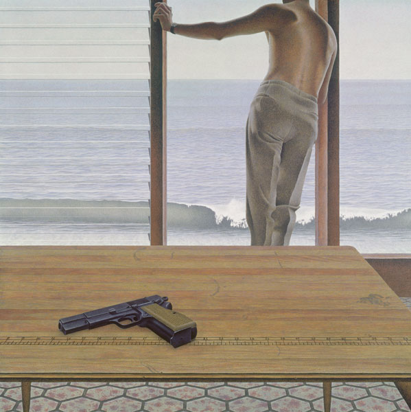
Pacific by Alex Colville

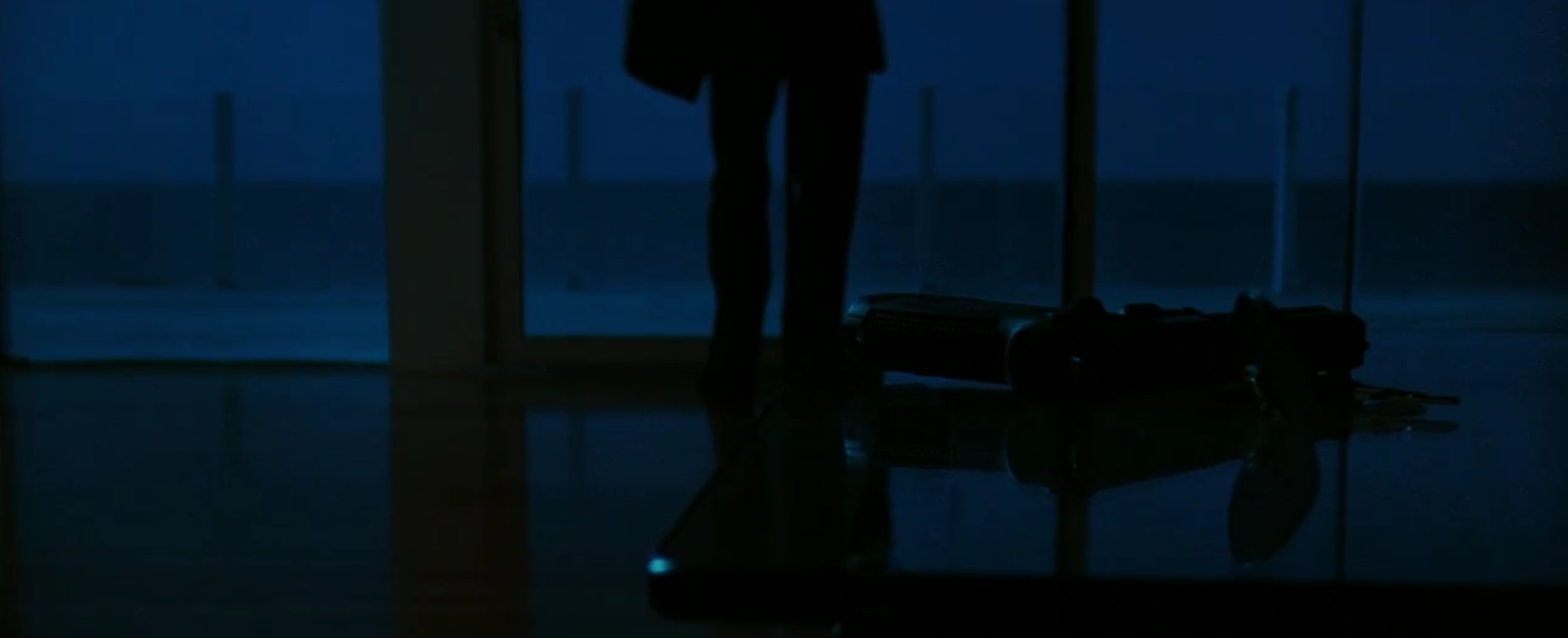
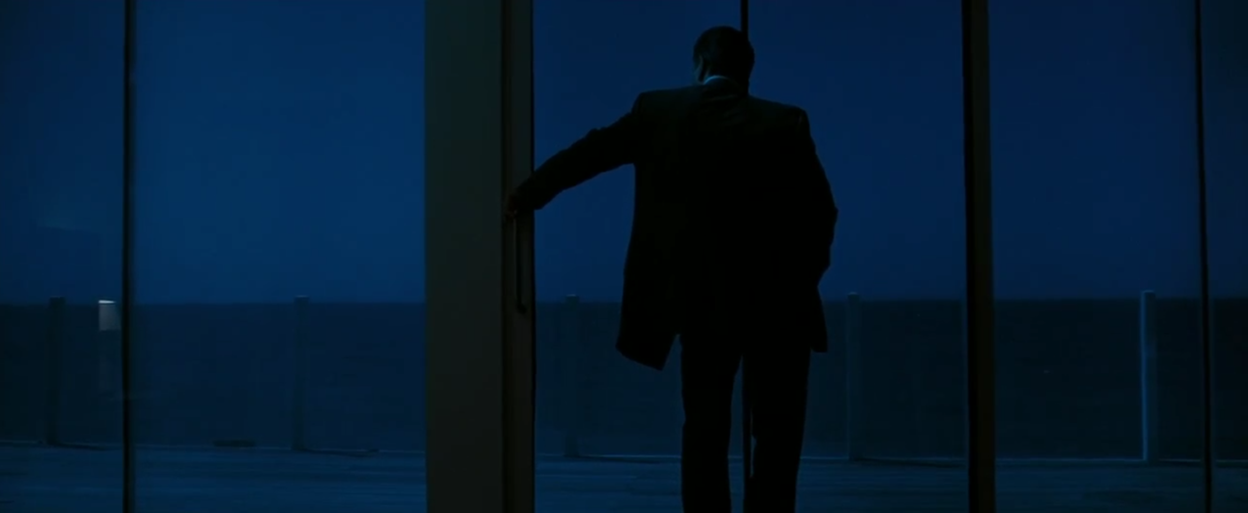
Love this painting, Pacific by Alex Colville, which inspired Michael Mann when making ‘Heat’.
So much mystery, so many questions from such a sparse image.


“This shot was used in an almost exact recreation as viewers see Neil McCauley coming home to an empty house, showing Neil’s life is bare of material things and human connection. “That was a profound sense of maintained, sustained alienation and loneliness. That’s how it affected me in the painting so I took great pains to recreate it.”
flickeringmyth.com