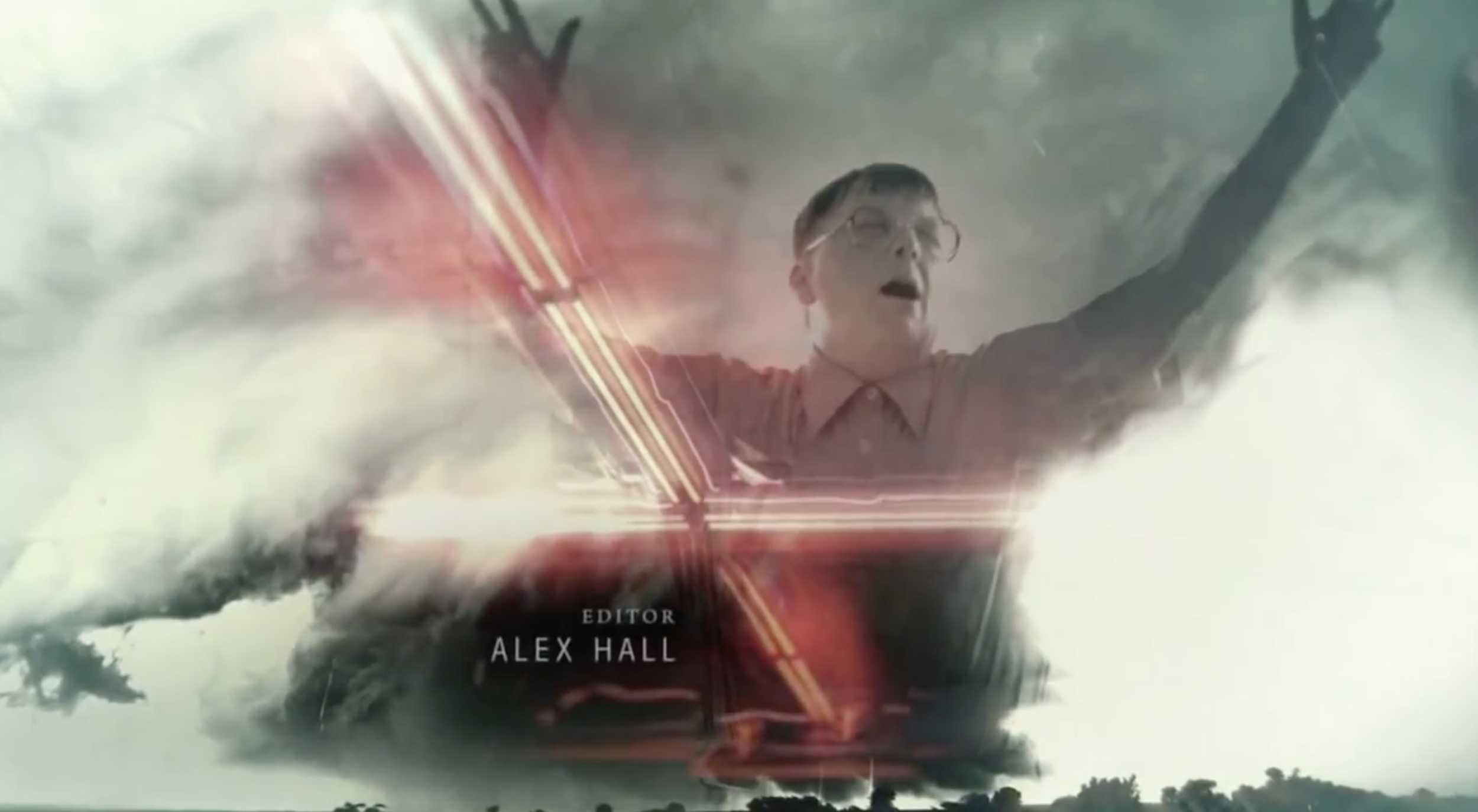
I’m finally getting round to watching True Detective, I’m only up to episode 3 so far, and really enjoying it. Suffering a little from all the hype I feel, and involving themes that seem to have been covered in some other recent films and tv shows. But I’m only at episode 3, so can’t judge it fully yet.
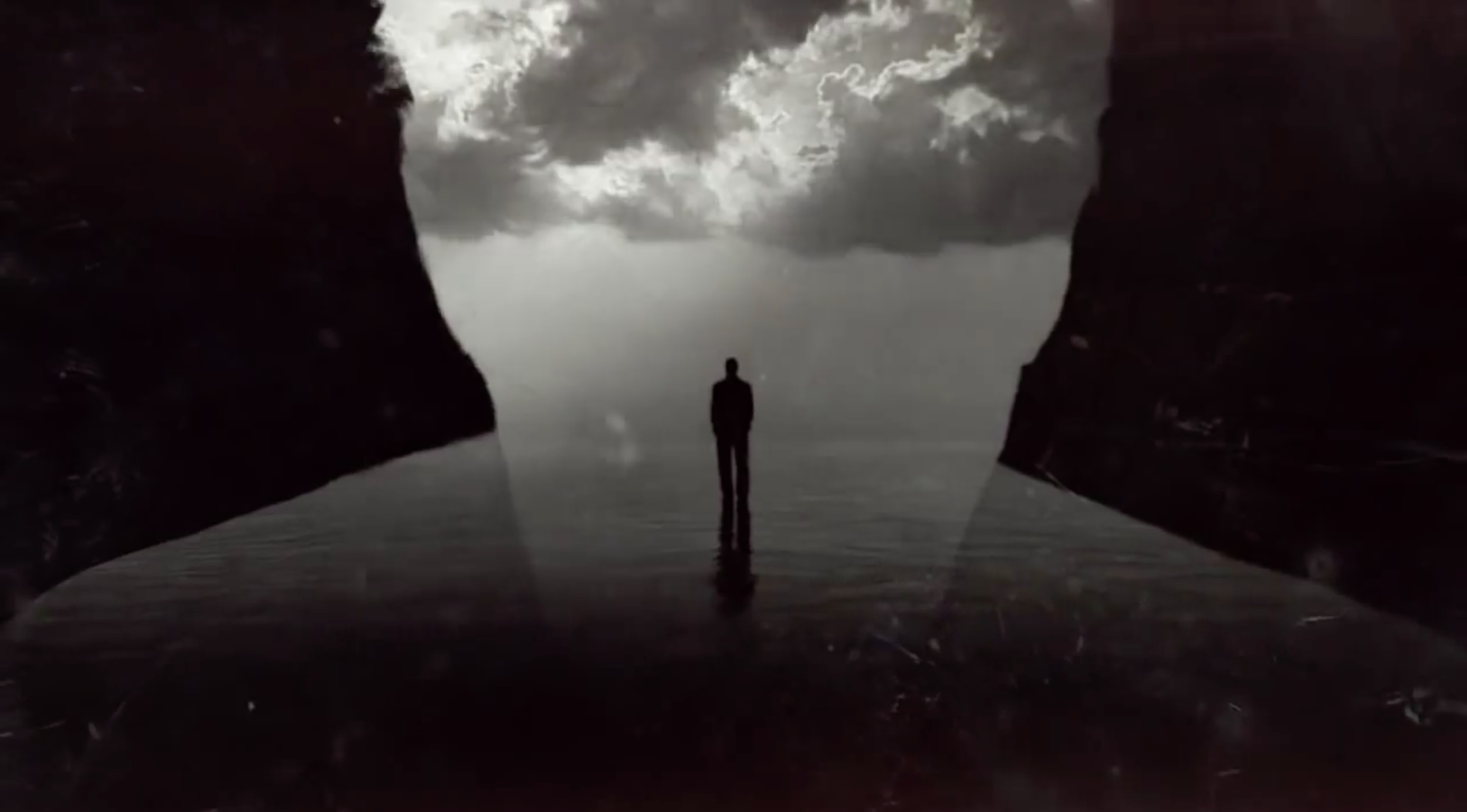
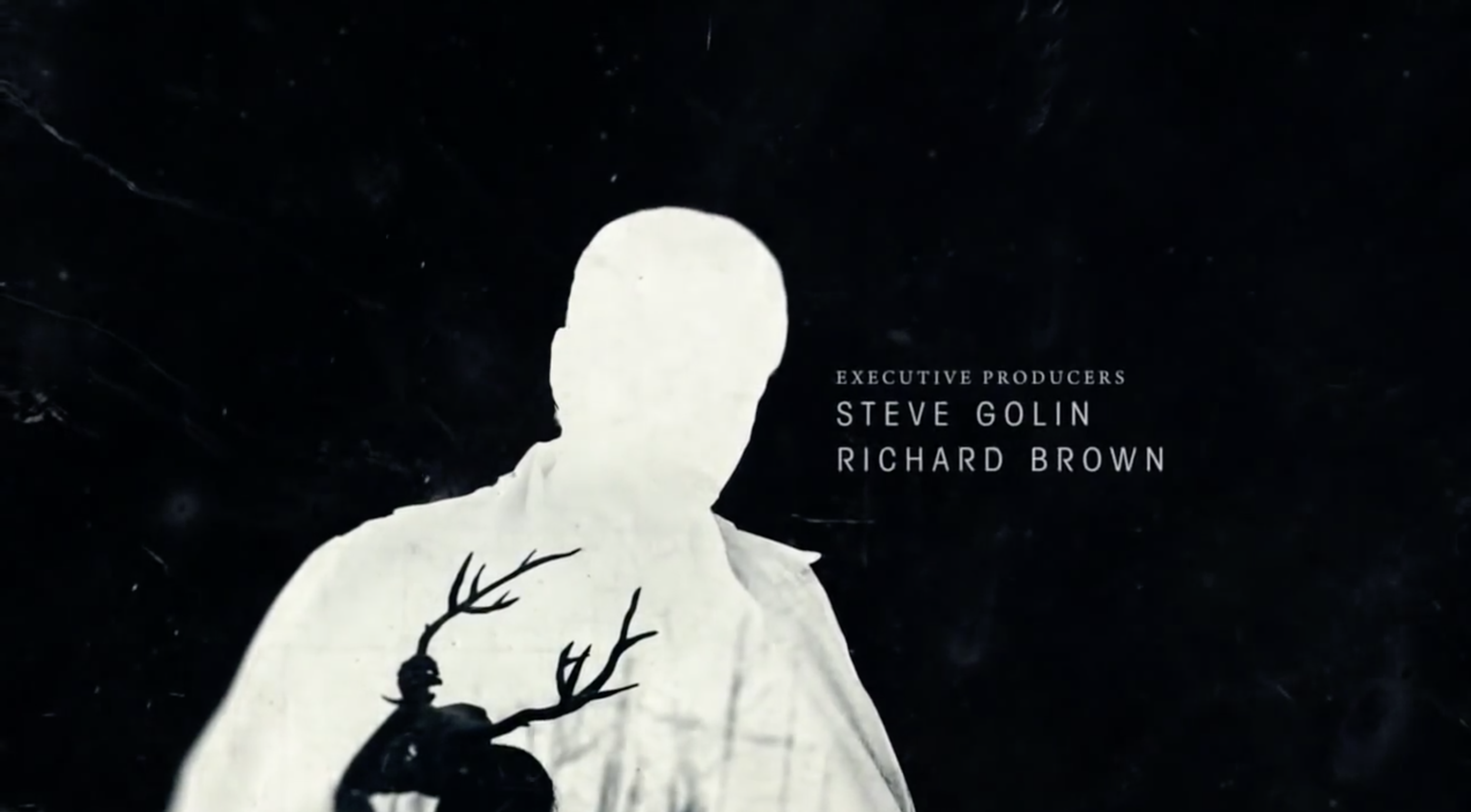
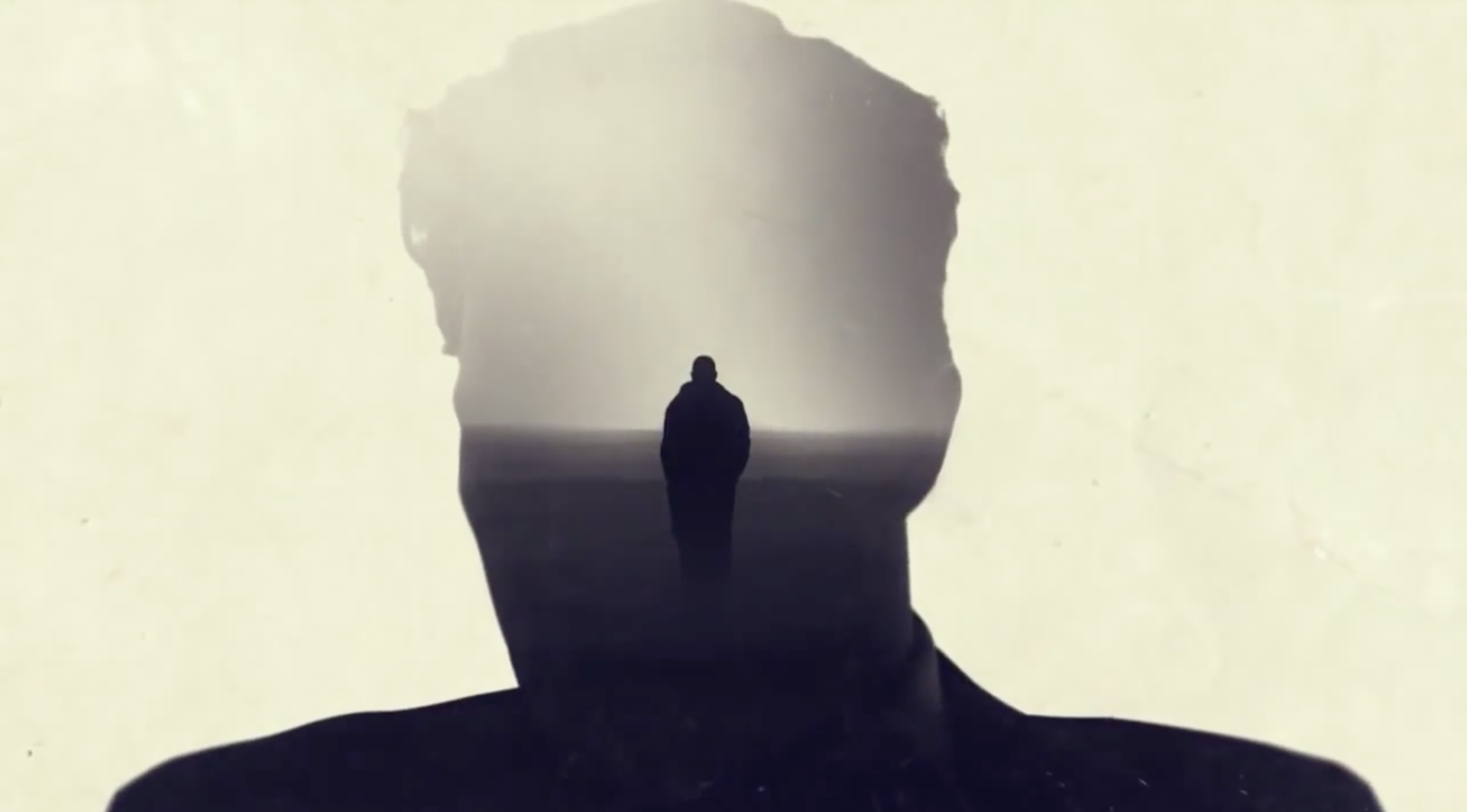
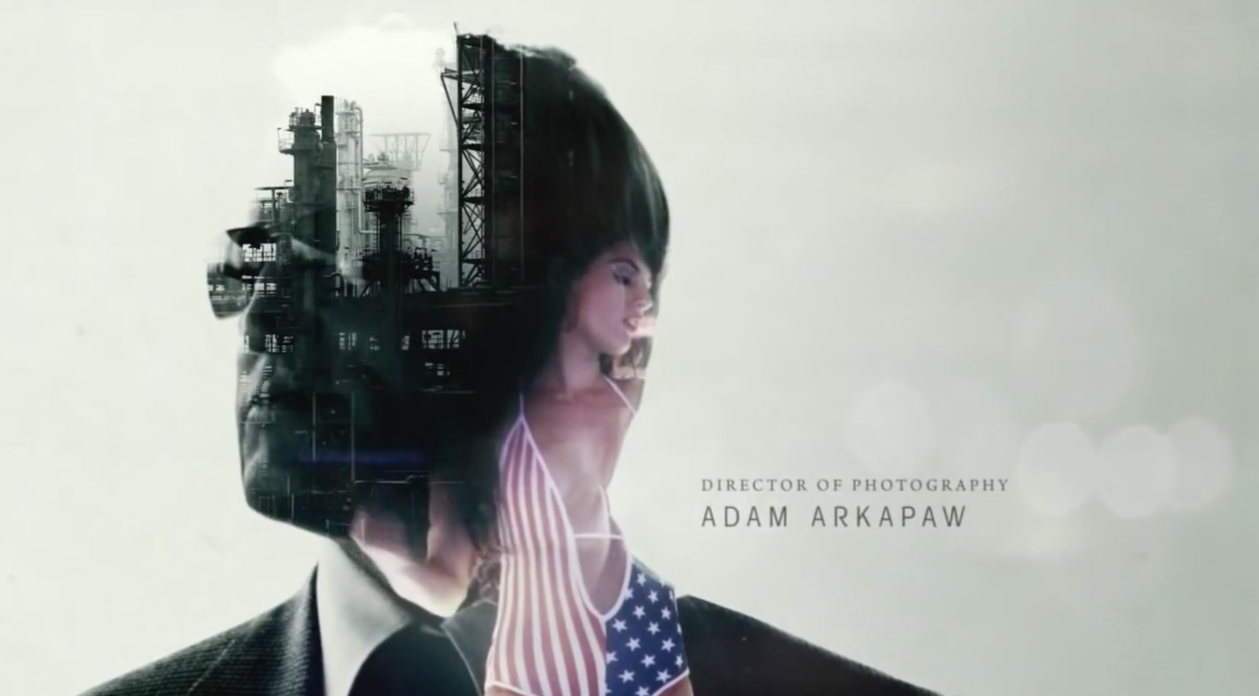
What I can comment on is the title sequence, which is really striking. It easily passes the test of ‘pause any frame and it looks like a beautiful image’. Seriously, I dare you to find a bad frame in the whole sequence, there isn’t one. Art of the Title has done a fantastic job of giving a very detailed breakdown of the sequence, and an interview with the Creative Director Patrick Clair.
So this is short and sweet – just a link to the sequence and some of my favourite frames from it
