I watched this short documentary on John Baldessari a few years ago, and it's remained one of my guiding lights as to how to make a documentary entertain and inform you about so much of the subject, whilst keeping it short and very sweet.
Are you not entertained?
The best advertising entertains you.
It draws you in.
It makes you think.
It might even make you smile.
Most importantly for clients, successful advertising communicates something useful about a product or service to potential customers, which will help lead to behaviour change, interest or even a sale.
Most importantly for the unsuspecting audience, they’ll feel something.
And when they feel something, they’ll remember it.
Advertisers often seem to forget this last part.
(Some forget the bit about communicating something useful too.)
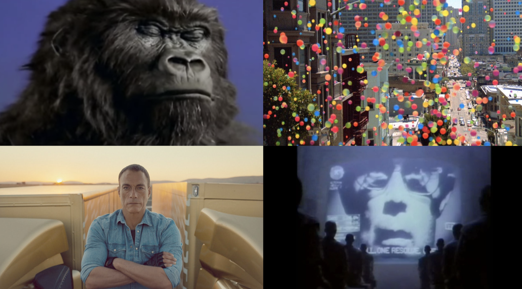
A Gorilla, Bouncing Balls, The Splits & Big Brother
I look at the four ads above as great examples that entertain you, whilst communicating something inherent about the product/service/brand that remains true, no matter how fantastical or deceptively abstract the visuals or story may be.
In the past I even used them (and other examples from Levi's & Guinness) as examples to explore 'What's the difference between an ad and content?'. Even then I was convinced that the fact they entertained you, elevated them to something more than advertising. But perhaps that confused the job of advertising and that the 'minimum viable product' of advertising should be to entertain first?
It's quite likely some of the most memorable things you've been taught or learned from, were delivered or experienced in an entertaining way. Whether it was a particularly charismatic teacher at school, a documentary about an obscure subject or seeing something of yourself in a character in a favourite film.
Films are certainly classed as entertainment (at least we hope so after paying £50 for a trip to the cinema), and coming from a film school background, as a director, editor and producer, I'm fascinated with bringing storytelling structures and the grammar of film to advertising to really increase the effectiveness.
Don Draper's Basic Principle of Advertising
I love this clip from Mad Men, even though Don (and most of the agency) are all high from a 'vitamin shot', this speech from Don really resonates:
I keep thinking about the basic principle of advertising.
There's entertainment and you stick the ad in the middle of the entertainment like a little respite.
It's a bargain.
They're getting the entertainment for free.
All they have to do is listen to the message.
But what if they don't take the bargain at all? What if they're suddenly bored of the entertainment? What if they don't… what if they turn off the TV?
Don Draper, Mad Men, ‘The Crash’ Season 6, Episode 8
"What if they don't take the bargain?" is a great question to pose to us all. It should be on all our briefs! Dave Trott often refers to making an impact is the first job of an ad. We have to always remember that the audience don't want to watch the ad, but if they glimpse it somewhere it will stand a better chance to make an impact if it's entertaining.
In an earlier season of Mad Men, we see a great example of this for Don's Clio award winning ad for Glo-Coat.
Don's interview with AdAge summarises it well:
“I wanted it to be indistinguishable from the movies.
I wanted people to be watching it and say,
“What’s happening in the story right now? Oh…it’s something else. It’s not an ad.”
At least not for the first 30 seconds of it."
Don Draper, Mad Men, ‘Public Relations’ Season 4, Episode 1
It's a great insight into what we should all be doing in advertising.
The best ads have always delivered this.
Joy = $$$
It's interesting to compare the approach of advertisers to the (relatively) recent stellar success of Netflix, in terms of creating original content of great value to audiences.
Netflix is a company dedicated to creating entertainment for people. Reed Hastings mentioned on Andreessen & Horowitz’s Podcast - Tech & Entertainment in the ‘Era of Mass Customization’ - 21m30s- Netflix’s approach to investing in joy:
“We’re about $8 billion in revenue this year, and [...] the customer is all of you. You are giving us your money, and our job is to turn that into joy. What we have to do is create amazing content, stream it perfectly all over the world to you. And if we do that, you will give us more of your money and then we have to turn that into joy. And so for every incremental billion dollars that you all give us, then it’s our responsibility to do the best shows that we can, that convert that into the most joy and we measure that with viewing, and a few other metrics as possible.”
House of Cards was released in February 2013 and since then Netflix has invested heavily in creating high quality content, as outlined by Hastings in the above quote.
Looking at their market cap, it's clear the effect it's having on their business.
January 2013 their market cap was around $25bn, by July 2017 their market cap is around $150bn.
Netflix are shy to share their audience numbers with the public, but what is clear is they are listening to audiences and backing it up with their analytics to keep making great original content that people love.
So what should advertising learn from this?
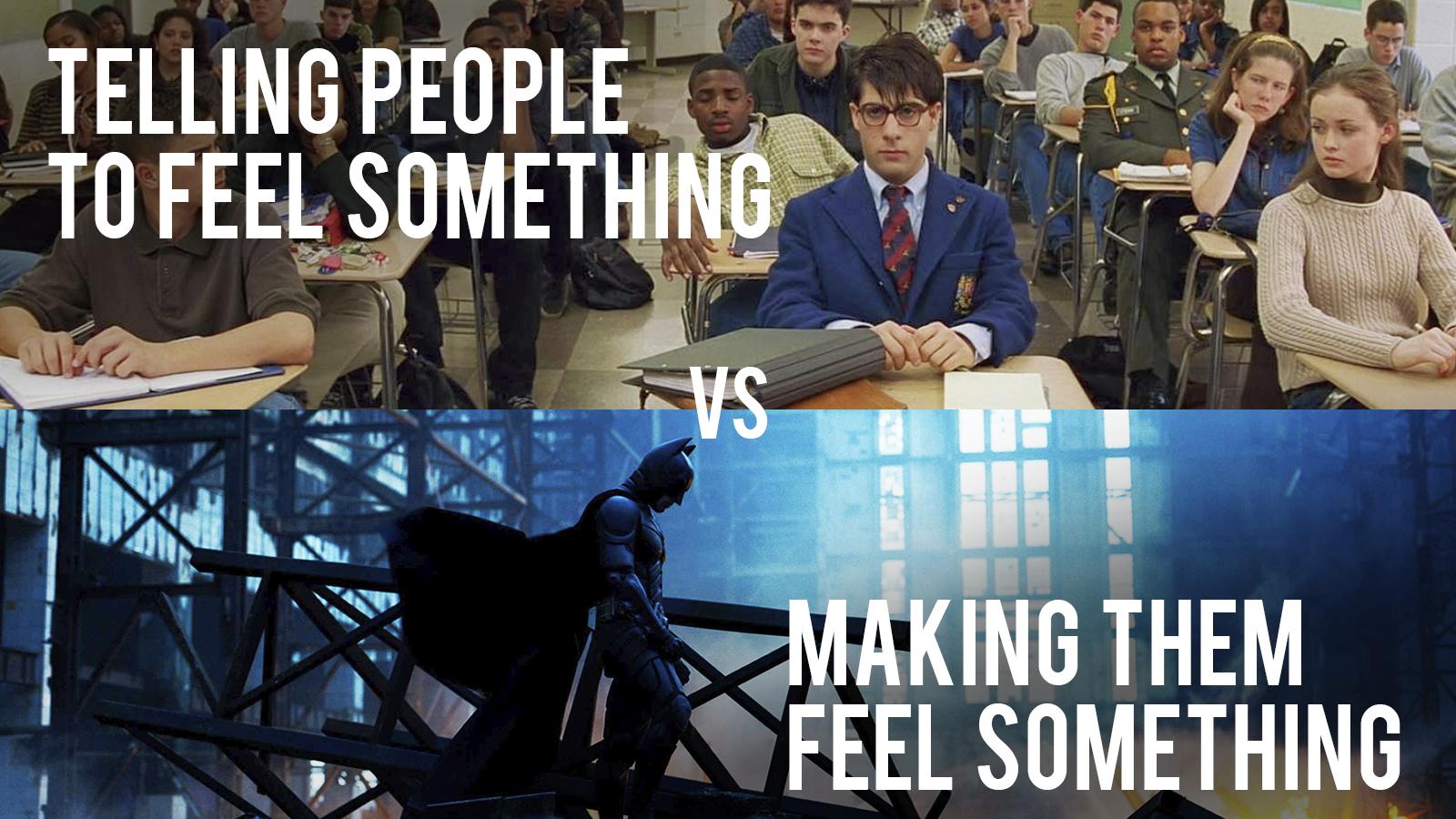
Show don't tell
We have to move away from telling, and think about making an audience feel something.
In addition to asking how our ad’s will make an impact, we should also ask ourselves 'What do we want the audience to feel?'
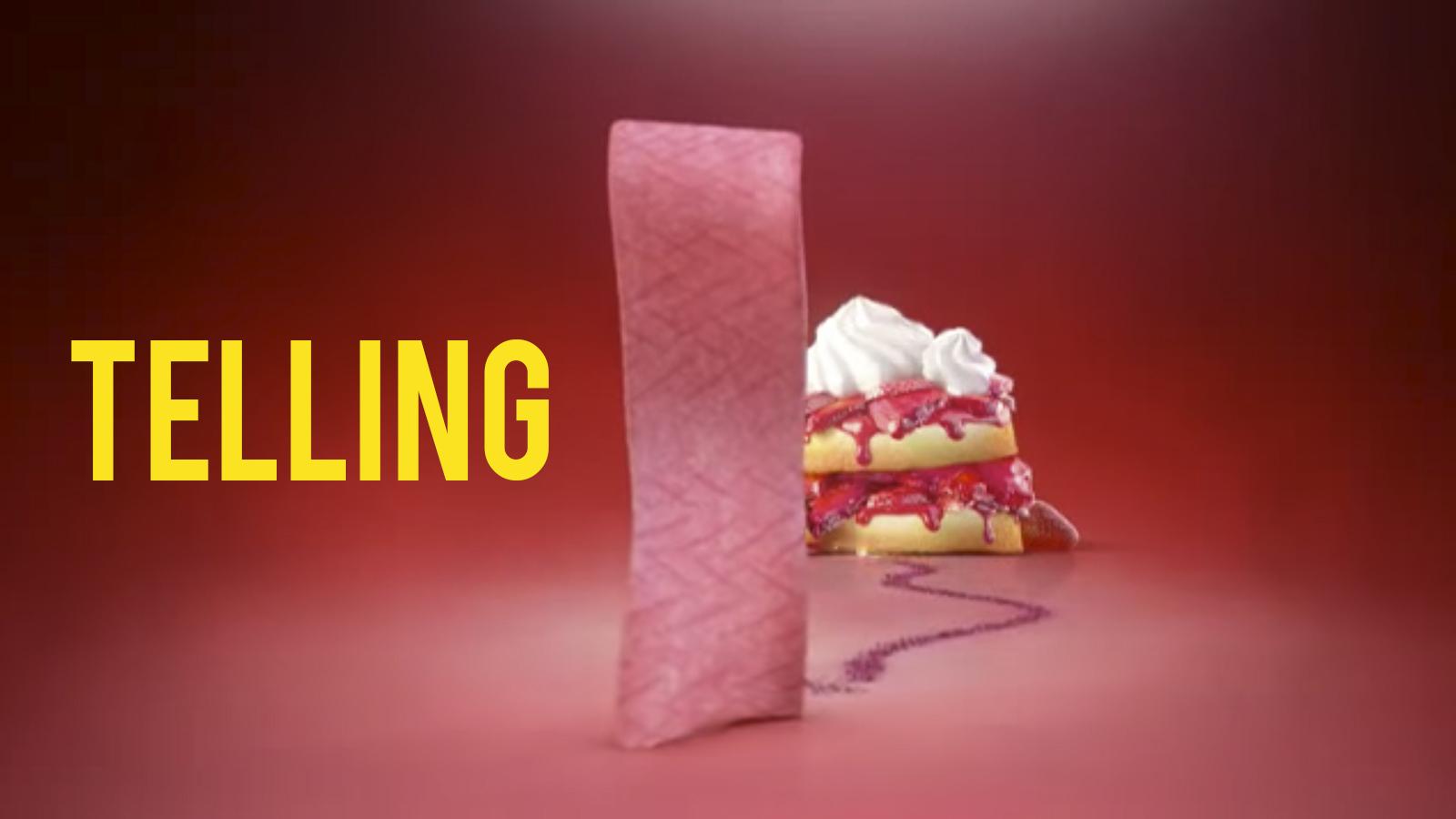
There was a great talk at Cannes where the CCO of BBDO and the CMO of Mars spoke about their work together and how they collaborated. They decided together to totally change how all their brands were marketed. It has led to some memorable campaigns from Snickers ‘You’re not you when you’re hungry’ and Skittles ‘Taste the rainbow’. As a stark comparison of before and after, are these two ads for Extra gum.
The first example is an all too familiar ad style, a 3D animated product with a list of its ‘features’. Not particularly offensive or inoffensive. It’s not memorable either, it could be from any brand.
But it's just telling you about the product, it's not making you feel anything.
In the second example, they created a short film about a young couple whose key moments in their blossoming relationship are all captured by the boy drawing little illustrations on the wrappers of his chewing gum.
Yes, it's corny and the end tag line 'Give Extra, Get Extra' lands with a thud, but it would take a battle hardened cynic to not get captured by the emotion of this ad, it’s a lovely idea and beautifully executed. It results in a highly effective piece of advertising for a chewing gum brand that had falling sales and was in dire need to differentiate itself from the competition. Following the release of that ad it received 1.3 billion impressions, 110 million video views, 1.4 million shares, was voted one of the most iconic ads of 2015 on YouTube and most importantly it reversed two years of declining sales for the brand.
Speeds and feeds
There's a great quote from Steve Jobs about branding, when speaking to a group of Apple employees in 1997, about how the Apple brand was in a state of neglect. He was expressing his vision for how to bring it back, from a marketing perspective.
“Marketing is about values. This is a very complicated world. It’s a very noisy world and we’re not gonna get a chance to get people to remember much about us. No company is. So we have to be really clear about what we want them to know about us.
Now Apple, fortunately, is one of the half a dozen best brands in the whole world. Right up there with Nike, Disney, Coke, Sony. It is one of the greats of the greats. Not just in this country, but all around the globe. But even a great brand needs investment and caring, if it’s going to retain is relevance and vitality. The Apple brand has suffered from neglect in this area in the last few years and we need to bring it back.
The way to do that is not to talk about speeds and feeds. It’s not to talk about mips and megahertz. It’s not to talk about why we’re better than windows. The dairy industry tried to convince you for twenty years that milk was good for you. It’s a lie, bt they tried anyway. The sales were going like this [gestures down], then they tried ‘Got Milk?’ and the sales did this [gestures up]. ‘Got Milk?’ doesn’t even talk about the product, matter of fact it focuses on the absence of the product!
But the best example of all, and one of the greatest jobs of marketing that the universe has ever seen is Nike. Remember, Nike sells a commodity! They sell shoes! And yes, when you think of Nike, you feel something different than a shoe company. In their ads, as you know, they don’t ever talk about the product. They never tell you about their Air soles, or why they’re better than Reebok’s air soles. What does Nike do in it’s advertising? They honour great athletes and they honour great athletics. That’s who they are, that’s what they’re about.”
I love this clip of Jobs, I watch it often as it’s littered with so many great insights. But what really stands out here is a couple of great examples about how to market effectively. Not to focus on ‘speeds & feeds’ but to try and make you feel something. It’s the same way Google wants to market too, ‘show don’t tell’.
This classic clip - where Microsoft playfully satirised themselves, visualising how they would have marketed the iPod - perfectly expresses a counterpoint to Jobs’ vision for marketing, with Apple’s beautiful and minimalist packaging being replaced with Microsoft's stickers and charts.
Speeds & feeds vs a feeling.
The Hero's Journey
In 2012, the Paralympic Games were broadcast on TV by Channel 4 and streamed online by Paralympic.org. They both created promo films to promote the games in order to attract audiences to the content.
These are two great examples which, for the purposes of comparison, have the benefit of promoting the same event, highlighting two different approaches very well.
Which one do you want to watch?
It’s hard to believe they're advertising the same event!
The first film is a great example of 'speeds and feeds', as Jobs would say:
What does 780 hours of sport mean to you?
What does 1000 hours of video on demand mean to anyone?
Is 4200 athletes, good?
I doubt many audiences can determine the value of the event based on these numbers, let alone get excited to watch it.
The Channel 4 promo is a masterclass in storytelling and getting you excited for something.
It focuses on the real people and their stories. It turns them into characters you root for.
There isn't one ‘speed’ or ‘feed’ in this promo.
Just raw, emotional stories with kinetic and powerful filmmaking.
You feel their pain, you share what they have gone through.
Suddenly you have an emotional connection with them.
They become heroes.
They become superhumans.
And you want to follow their journey.
Just like you would a character you love in a film.
So let's take a leaf out of Don's book and make our work indistinguishable from the movies.
Let's entertain audiences, and make them feel something…at least for the first 30 seconds of it.
The Oracles - Punchdrunk x Google Creative Lab
Creative Director - Robert Waddilove
A cross-platform experience designed for primary schools in North London. Cutting edge technology developed in collaboration with Google's Creative Lab and Grumpy Sailor blended digital and physical worlds to create magical moments of audience interaction.
We wanted to make a film that shared the experience for the YouTube audience, rather than a collection of talking heads.
Google - Build the Next Generation Mobile Web
Creative Director - Robert Waddilove
The mobile web is known for being slow, unreliable and generally not that great. Now there's a new solution: progressive web apps.
As the film was designed for a specific audience, we worked with developers to ensure it spoke to them directly, using references they'd understand and relate to, whilst keeping it entertaining and eye-catching.
The film was popular with developers on the Google Chrome Developer YouTube channel too.
Google Arts & Culture - Holi Festival
Creative Director - Robert Waddilove
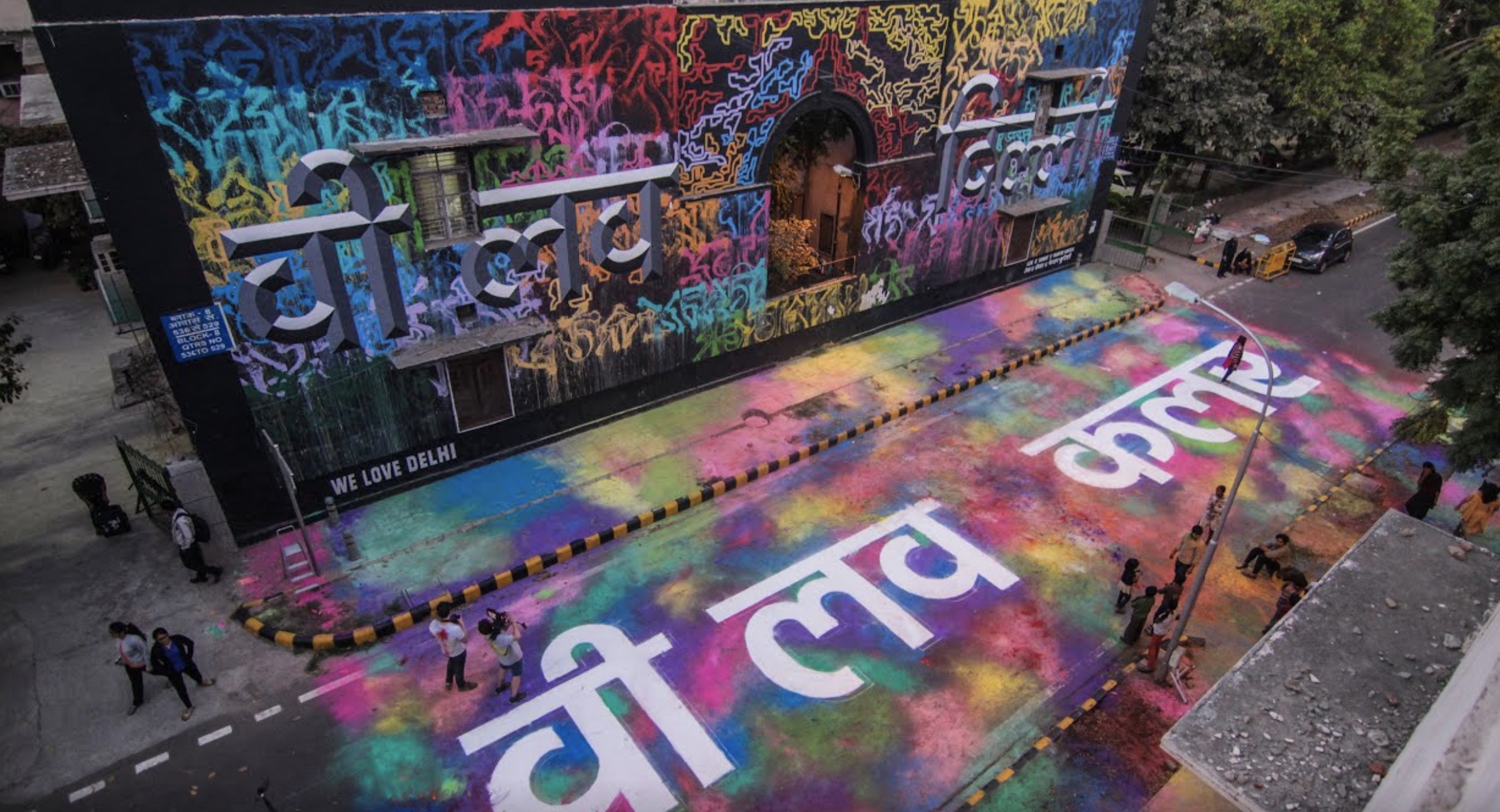
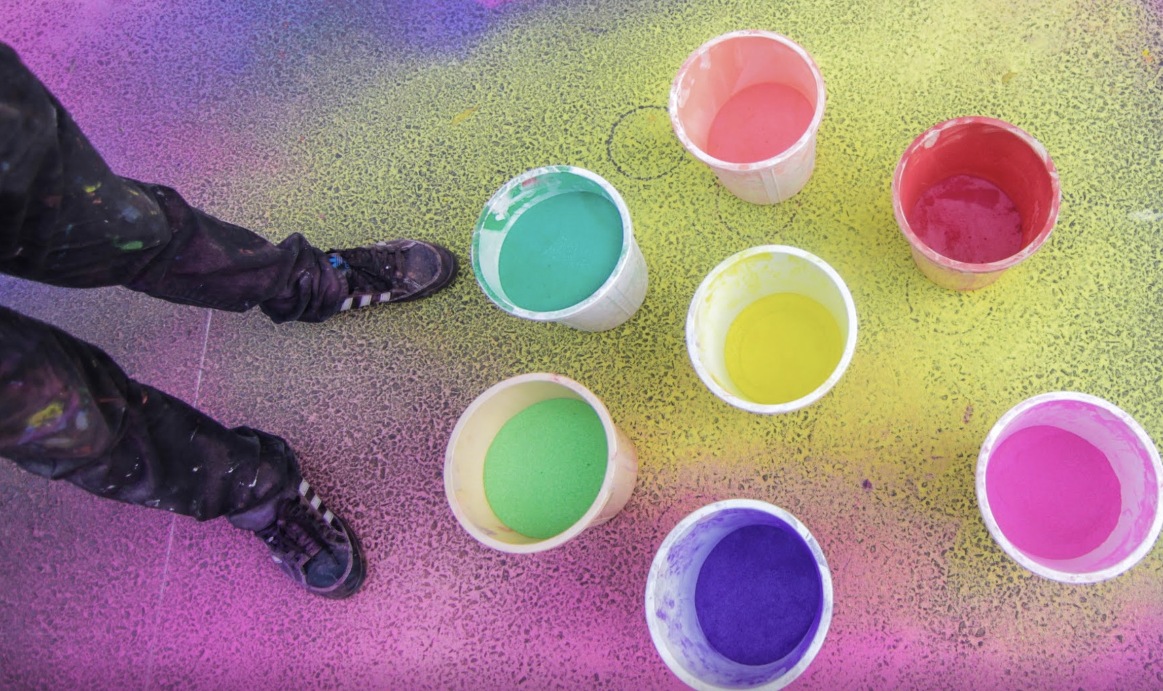
When Google wanted to promote a new collection in the Google Arts & Culture app, celebrating the Holi festival, rather than a straightforward promo we pitched the idea that Google should commission their own art work from a local artist. The creation of this piece would then form the promotion for the new collection.
You can see more of the collection and Hanif Kureshi's Rangoli on the Google Arts & Culture site.

